Before our training day with accessibility consultant Graham Armfield I had an awareness of coding for accessibility (also known by the numeronym a11y in the industry); images need alternative text, content styles should allow for zoom and colour contrast ratio should be fairly high. Having been present for an introductory talk on the subject at a recent WordPress Sheffield meetup I was also aware that designing accessible websites isn’t just about making content available to non-sighted users; every one of us is likely to experience accessibility issues at one time or another, whether due to injury, environment or simply trying to use a mobile browser one handed. Not surprisingly however, Graham demonstrated that there is a lot more to it than that!

On the day we drank a lot of coffee, ate a lot of biscuits and covered a LOT of accessibility issues, solutions and best practice ideas. As is often the way, the first thing I learned when getting started on the subject was just HOW MUCH I didn’t know. However, Graham made one encouraging point clear: even changing a single thing to make a site more accessible is going to help someone. Thankfully, this means that there is no need to trash all my existing work to begin again from a pleasingly accessible void. Incremental changes are still worthwhile.

One of the most obvious changes to begin with is making more considered use of HTML elements. As a junior developer I can say from personal experience it can be easy to forget about these fundamental building blocks, focussing instead on learning new programming skills that afford greater functionality or a sleeker user experience. However, without the right HTML base, that carefully crafted user experience can be clunky if not outright unusable for those with different accessibility requirements.
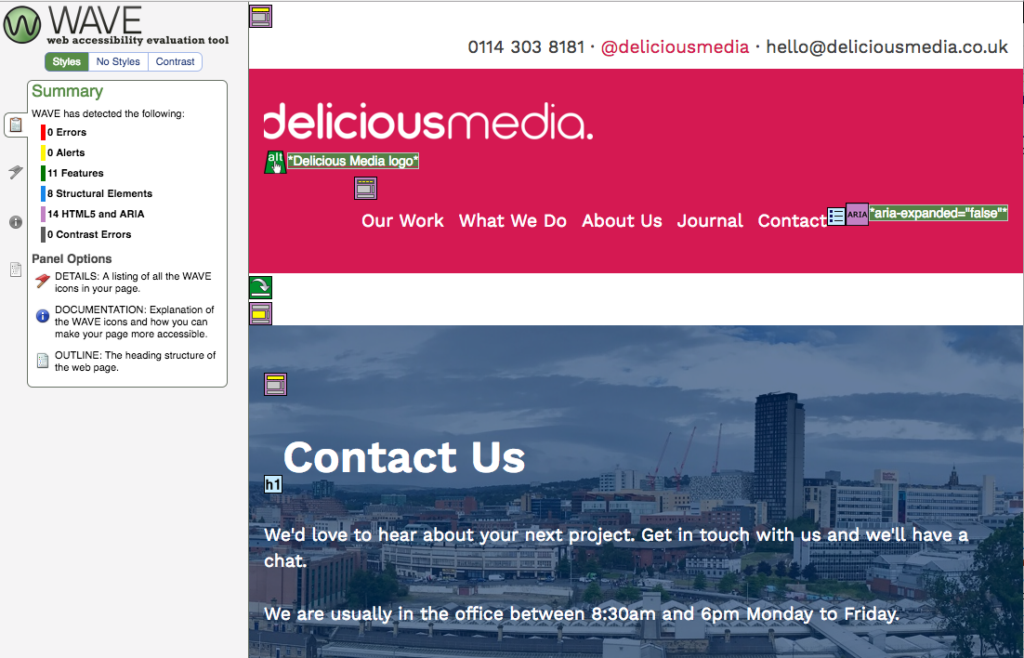
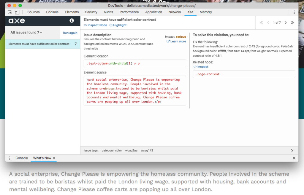
Delving deeper into accessible web development, Graham shared a lot of useful tools to help test sites and diagnose issues (some of which are shown in the images above).
Browser Extensions:
- Wave (Chrome and Firefox)
- aXe (Chrome and Firefox)
- Focus Indicator (Chrome)
- Landmark Navigation (Chrome and Firefox)
Favlet/ Bookmarklet:
Colour Contrast Checker:
Screen Readers:
Plugin:
Desktop Application:
Of course, this is just the beginning. We feel passionately that rather than being a special feature, accessibility should be an integral part of our work. Like anything in the web development world, it’s a subject that is continually changing and growing and will require us to continue learning, innovating and updating our practises. Thanks to Graham it feels like we’re off to a good start!

